Carousell
Rearchitect a shared ‘Me’ page
‘Me’ page is a key shared surface on Carousell. It suffered from the ‘tragedy of the commons’ as it tried to serve many user segments at once. Design consistency is low. Feature discovery was ineffective.
As the design lead for core seller experience team, I initiated the revamp proposal for ‘Me’ page. After getting stakeholder buy-ins, I mentored a senior designer in a pair design setup to execute the design implementation.
Overall impact
2x to 3x increase in Ctr across featuresestablished design governance on 'me' page for the whole org
Role
Design Lead: Execution + management. Team of 2.
Responsibility
Design Governance, IA, Product design, Visual design
Timeline
Jan 2025 - Mar 2025
Context
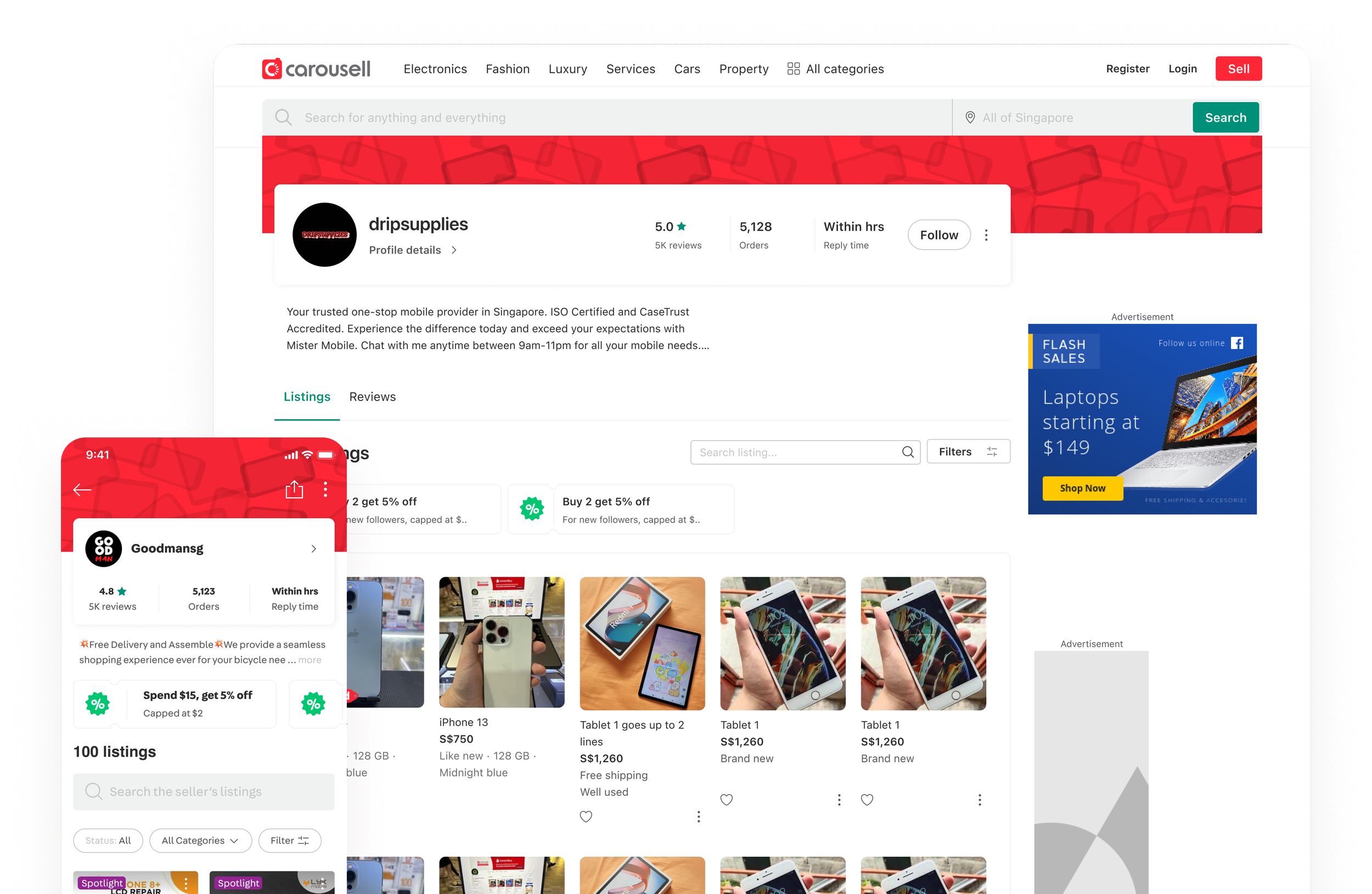
‘Me’ page is the 5th tab on Carousell app. Users can look at their profile and find account-related info here.
Many users, but no ownerAll domain teams use ‘Me’ page, but no one team fully owned it, leading to a fragmented and messy experience. All users use ‘Me’ page, but the page isn’t optimized to serve any user segment well.
Problems
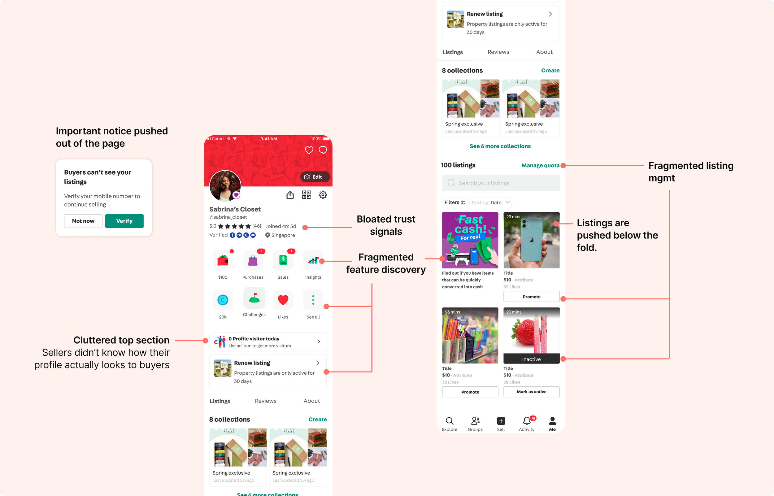
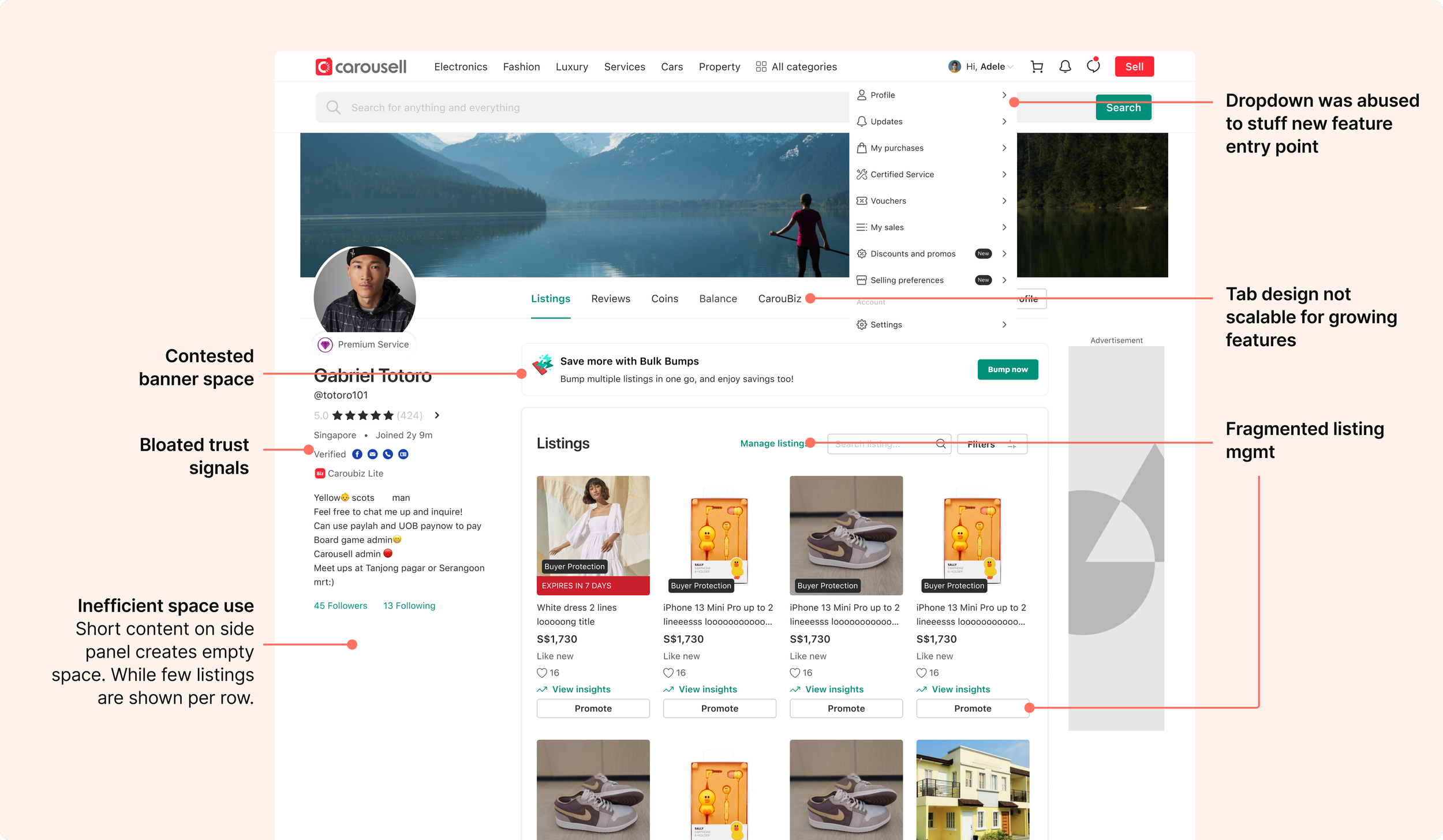
Users don’t have a clear view of all tools.
Listing management is fragmented. Users are unsure where to take listing actions.
Important account-related notices are missed as they lack a permanent entry point.
Sellers don’t have a clear view of how their profile looks like to buyers.
Buyers can’t compare seller profiles easily as trust signals are hard to understand.
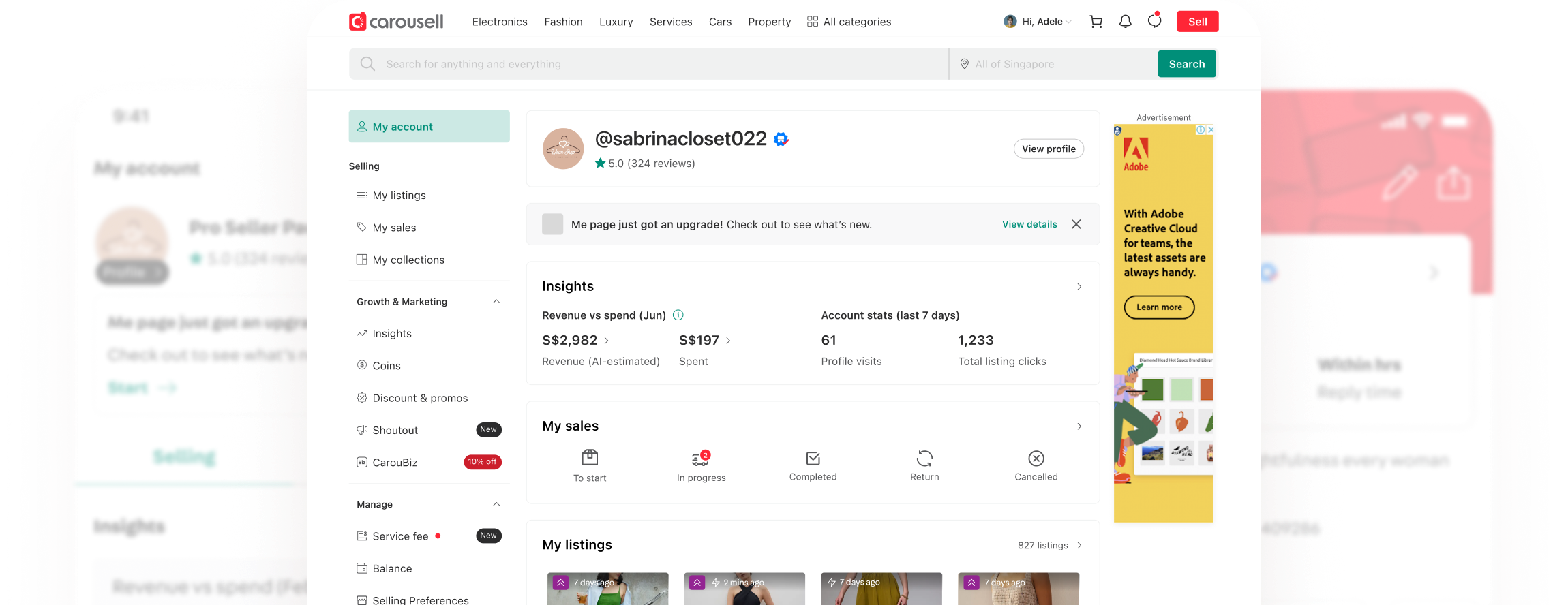
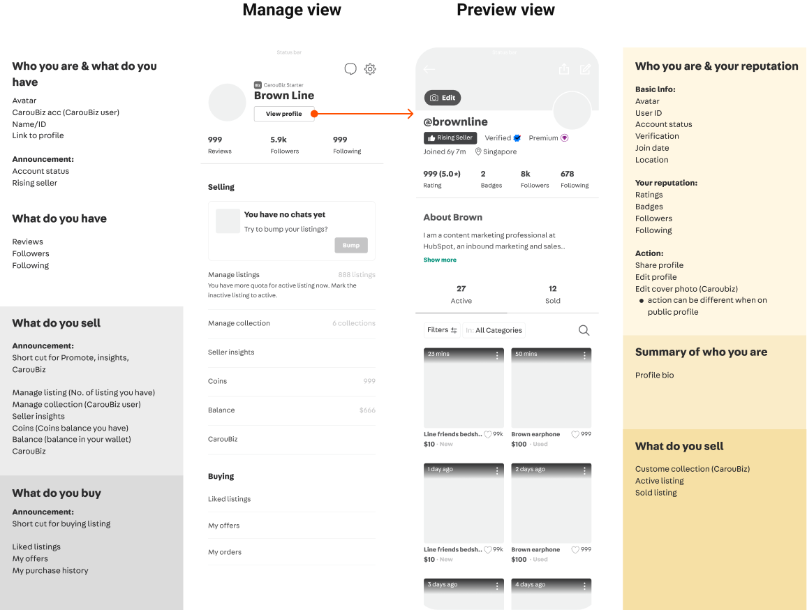
New ‘Me’ page: An overview
Solution and impact overview‘Me’ page was split into 2 separate views: Manage and Profile view. For both view, design was customized to each user persona’s needs. Design governance was established to ensure consistency across user types.
Feature discovery improved with 2x-3x increase in CTR across all tools.
Manage viewUsers have an organized view of their buying selling
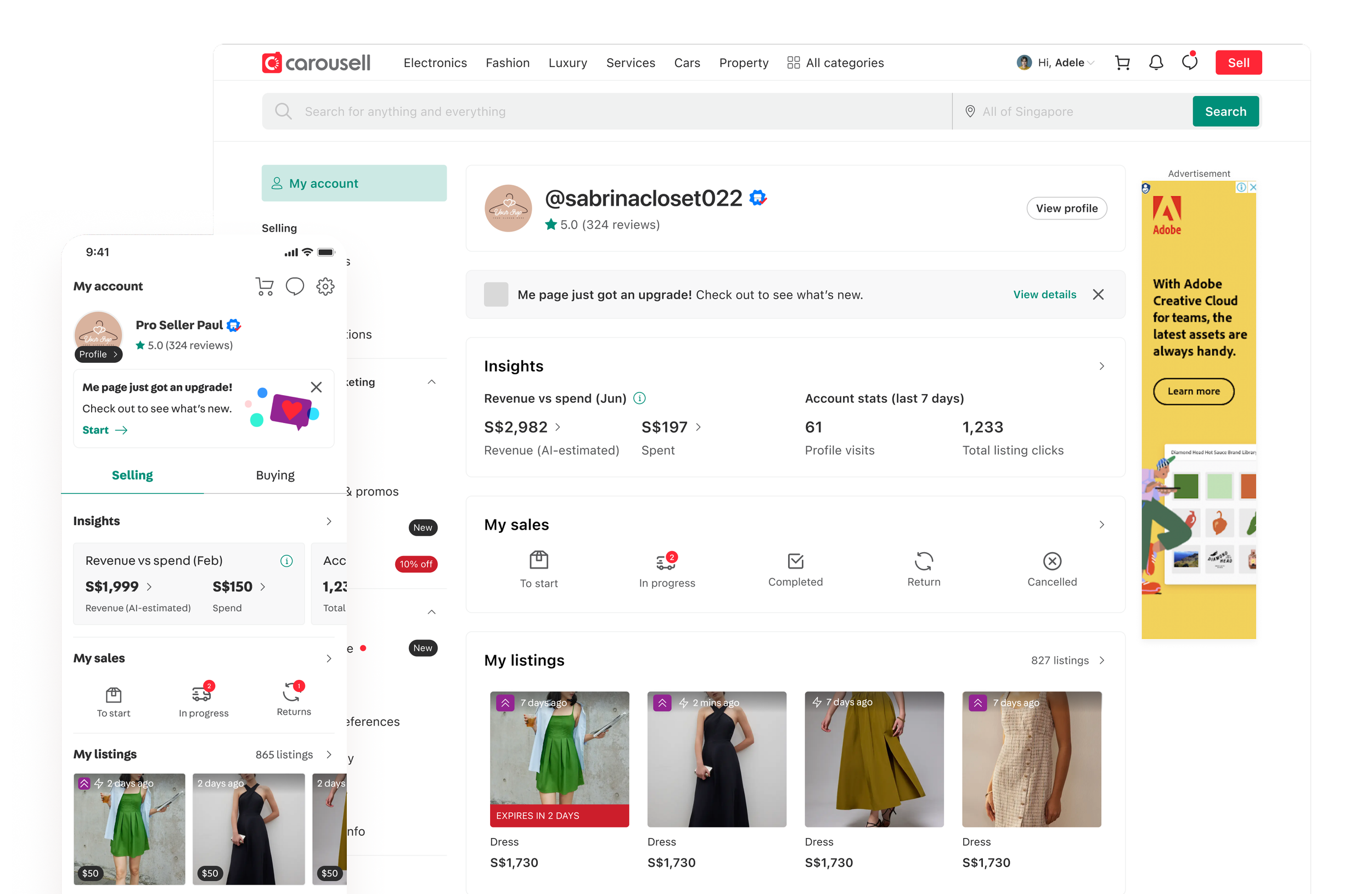
Profile viewUsers can preview how their profiles look like to other buyers
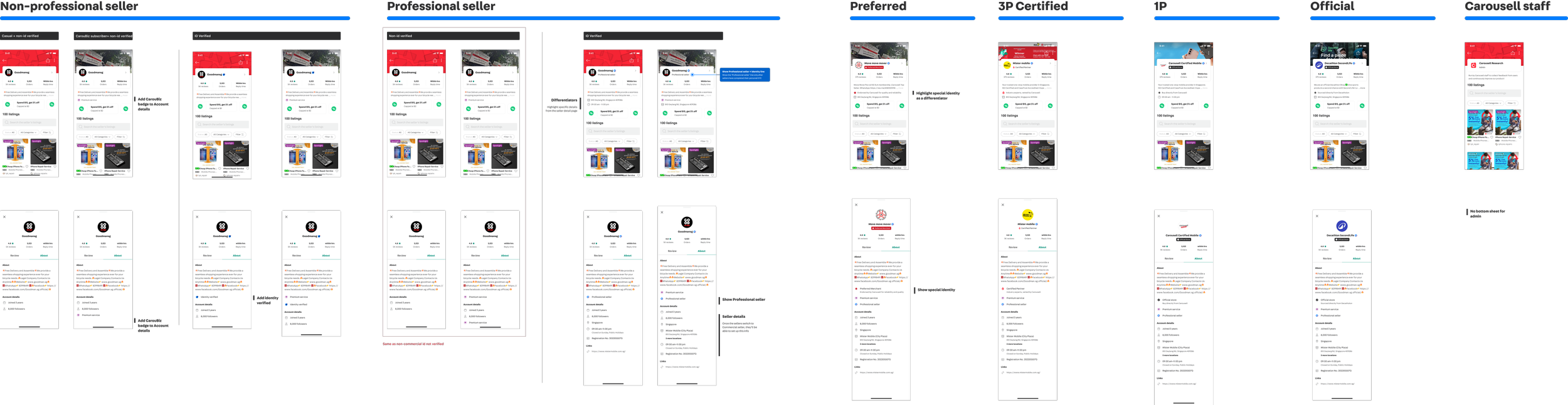
Design for all user types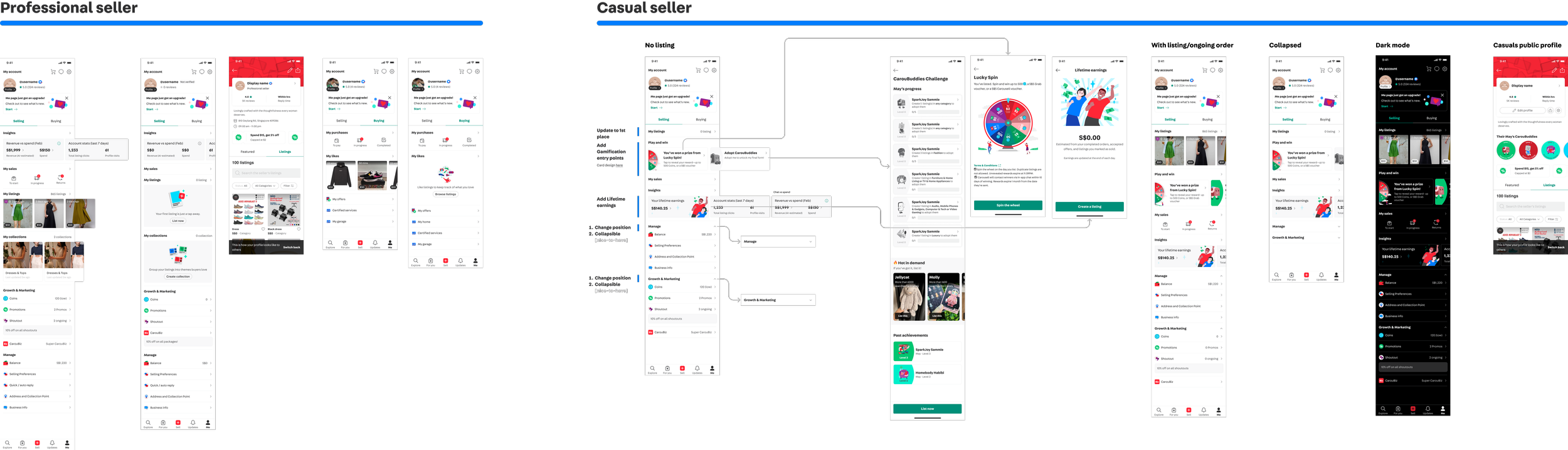
Process
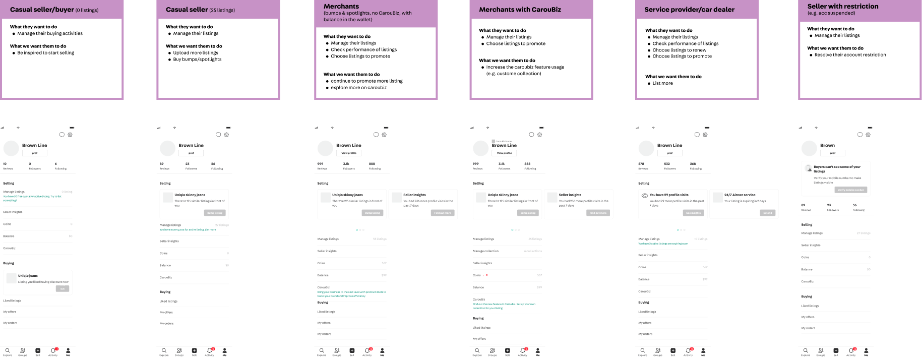
Collecting use cases for 6 different types of personas and consolidate current and future tools across the org.
Use casesWhat do users and teams use ‘Me’ Page for
PersonasDifferent type of users that use ‘Me’ page and their differing needs

Re-architecture: Splitting ‘Me’ page into Manage view and Profile view to address 2 distinctive major JTBDs.
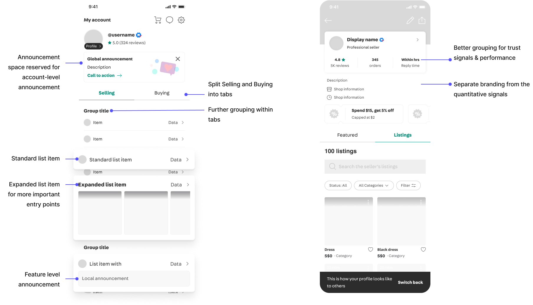
Created a slot system for the tools on Manage view. Stress-tested with each persona.
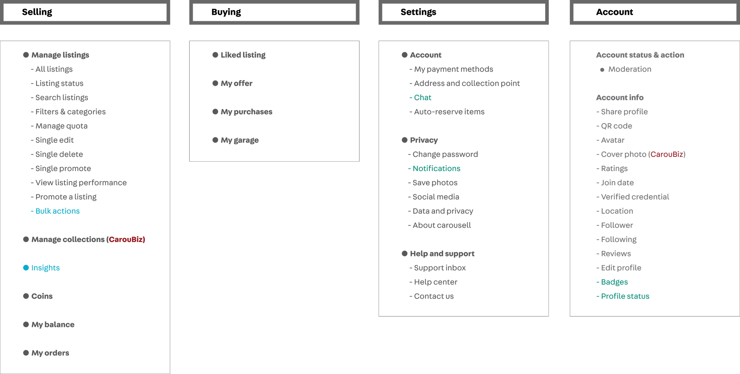
Info hierarchy & component structure
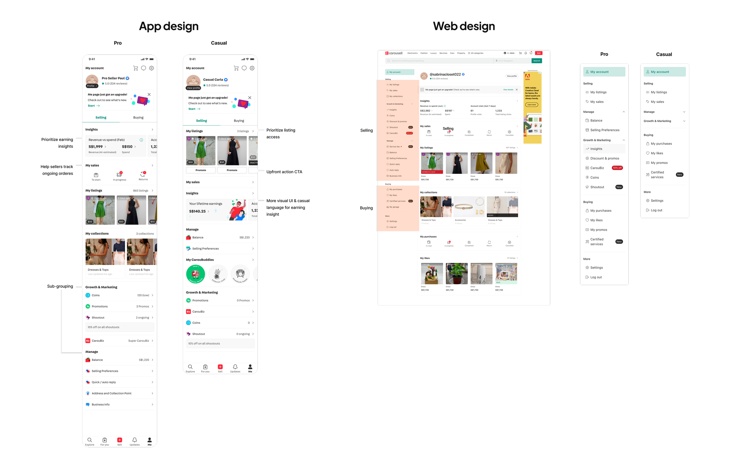
UI design & example of persona difference
Ease users into the major change with micro interaction
Guided onboarding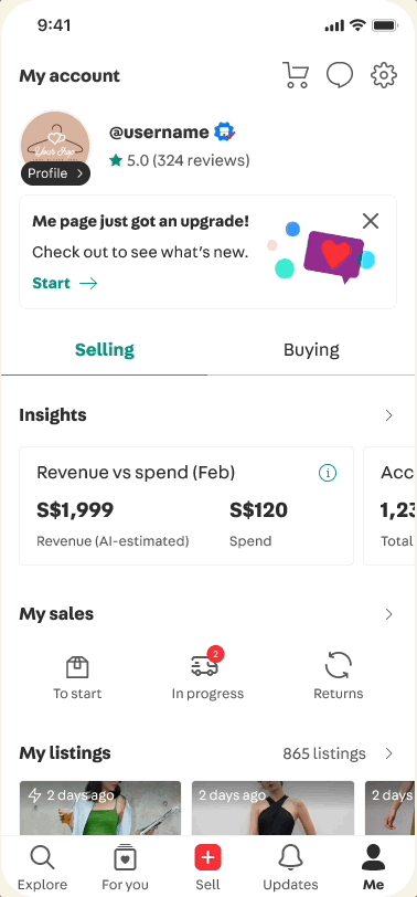
Drag-and-release gestural navigation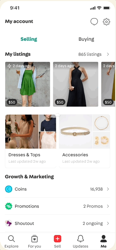
Impact
Beyond feature discovery metrics, I established a consistent design language and governance for a shared space on Carousell. This not only improves design quality, but also design and implementation velocity for future updates.
2x to 3x increase in Ctr across featuresestablished design governance on 'me' page for the whole org
Go to next project