Carousell
Design simple and effective Ad ecosystem
Carousell’s ad suite enables professional sellers to reach more buyers.
I joined the team during its transition from a simple, limited product to a comprehensive suite. With product maturity comes the complexity that requires thoughtful design to ensure simplicity and effectiveness. I led the strategy and executed several improvements over the course of 2 years.
Overall impact
7% ad spend uplift51% ad performance uplift for selected ad typeReduced campaign friction from locked funds and refundsStreamlined workflow & UI patternLong lasting UX & product vision
Role
Design Lead: Execution + management. Team of 2.
Responsibility
Research, Strategy, Product design, Visual design
Timeline
2022-2025
Context
Carousell is a second-hand marketplace connecting casual buyers and sellers. As the platform grows in user base, professional sellers advertise on Carousell to grow their business. The pro sellers’ inventory covers new and used commodity products, high-value items like Autos and Properties, as well as Services.
Charting a holistic view
When I joined the team, improvements to the ad suite were driven largely by reactive responses to sales & support teams’ feedback and tactical algorithm changes. To look beyond isolated problems, I consolidated past research and conducted new ones.
User insights
It’s hard to distinguish between ad types.
Sellers spend significant time managing ad campaigns.
Outcome is unpredictable.
Competitive sellers are willing to spend more, but our ad options and formats are limited.
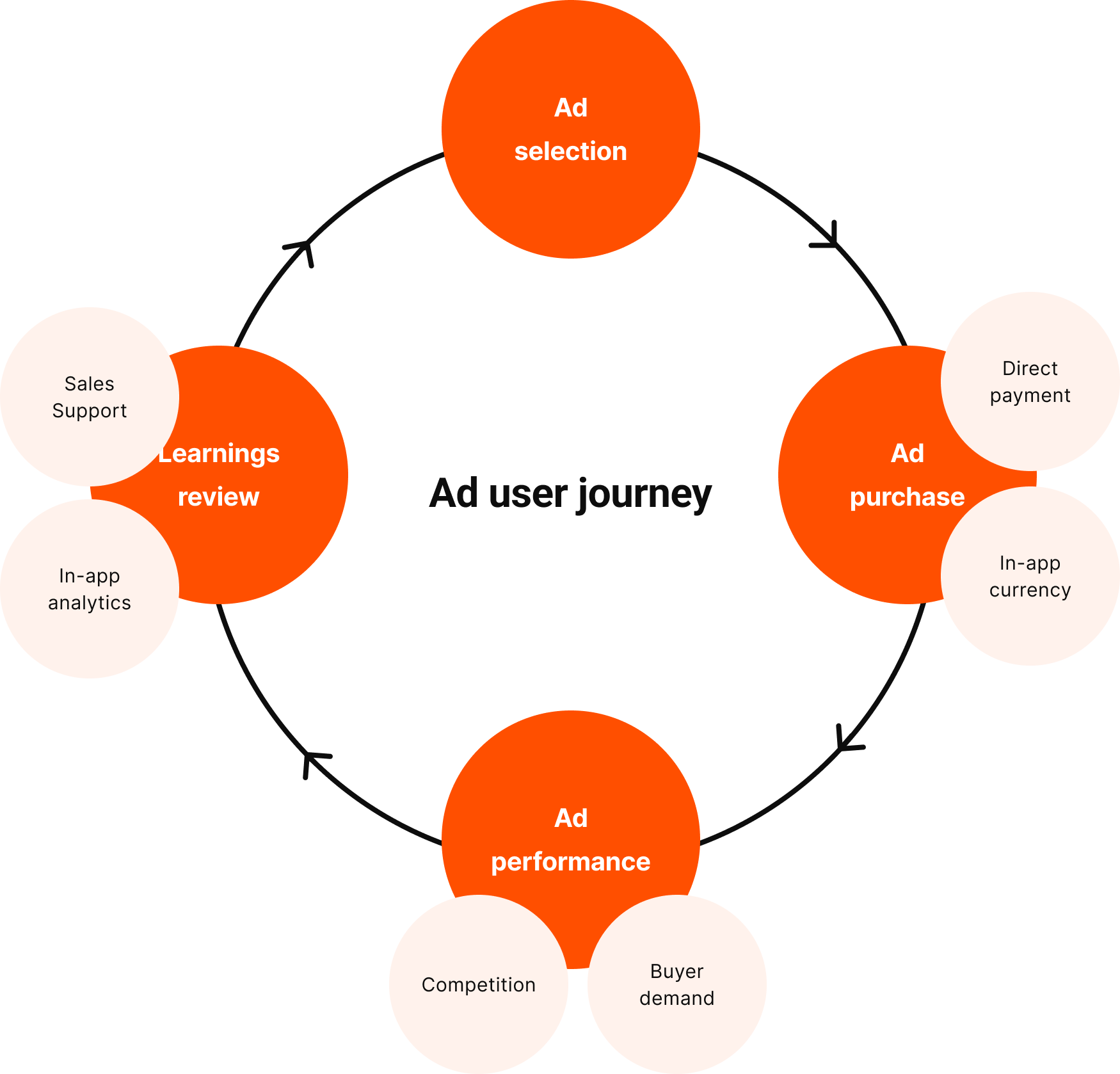
Cyclical user journey
I charted the 4-phase cyclical user journey, with internal and external factors affect each phase.
ad selection → ad purchase → ad performance → learning review → repeat
Key ad projects
I work on many more ad projects at Carousell. If you are interested to know more, reach out to me :).
01
Make ad selection simple
02
Make ad purchase efficient
03
Make ad performs better
04
Make learnings easy & meaningful
01. Make ad selection simpler
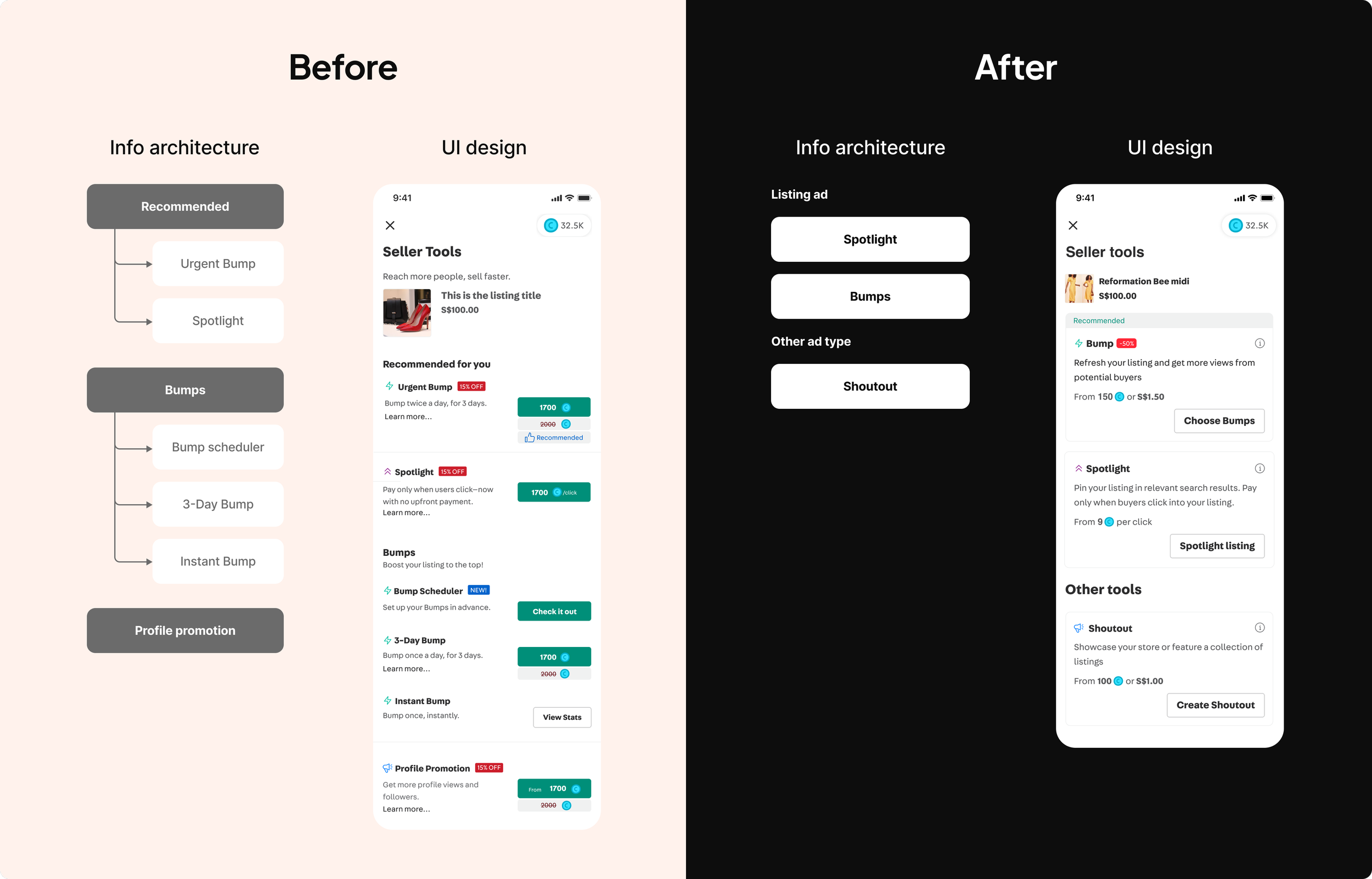
Iteration 1: Simplified IA
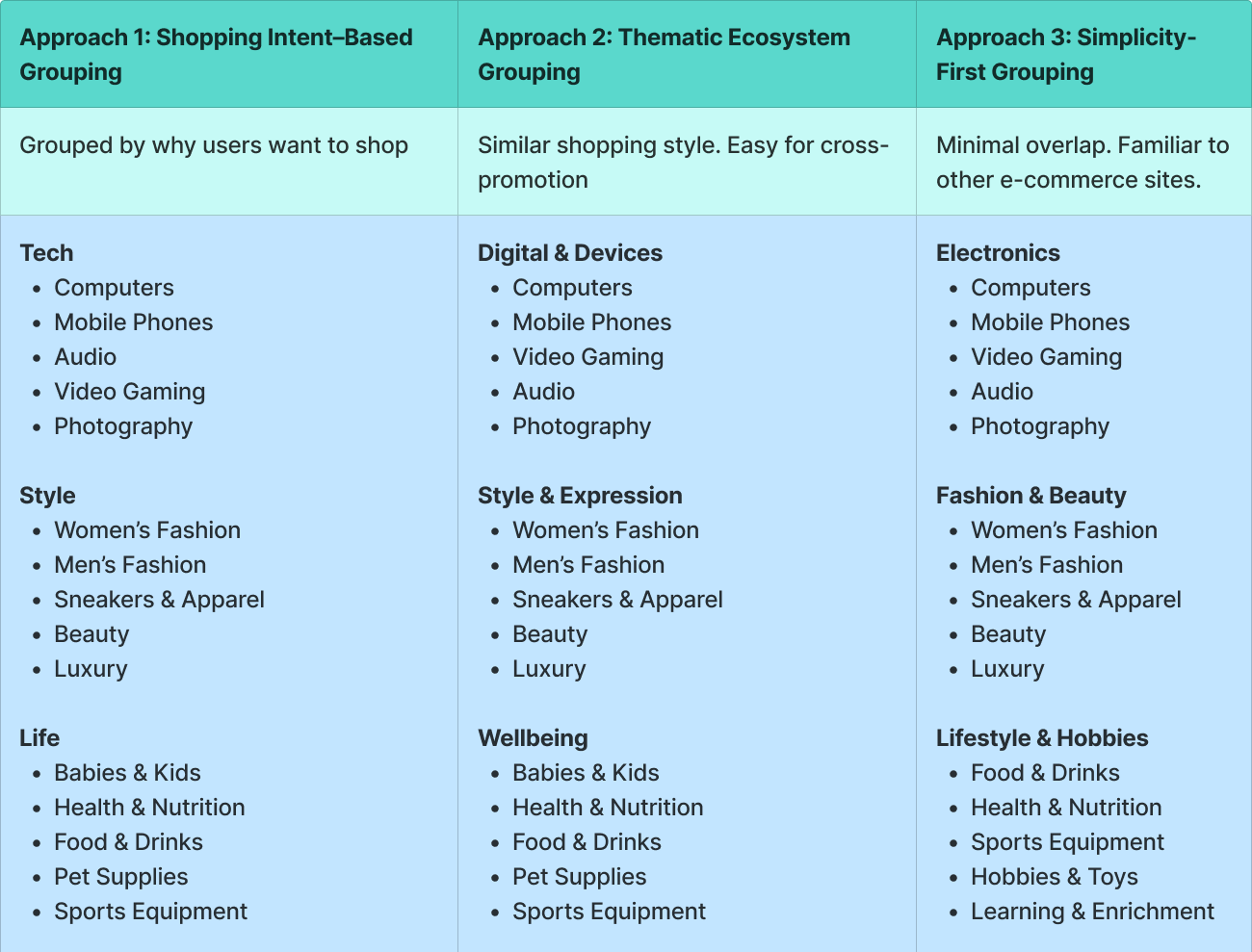
Old IA was driven by business needs to promote certain ad options. Sellers faced choice paralysis as options are too many, differentiation and grouping are unclear.
New IA establishes better grouping and hierarchy, reduces number of choices and helps users compare options better.
Iteration 2: Simplified mechanism - from tools to outcome
A key user pain point was sellers need to go through “trial-and-error” method to learn how each ad type works. However, their real JTBD is to get more sales, not to learn how ad works on Carousell.
End vision
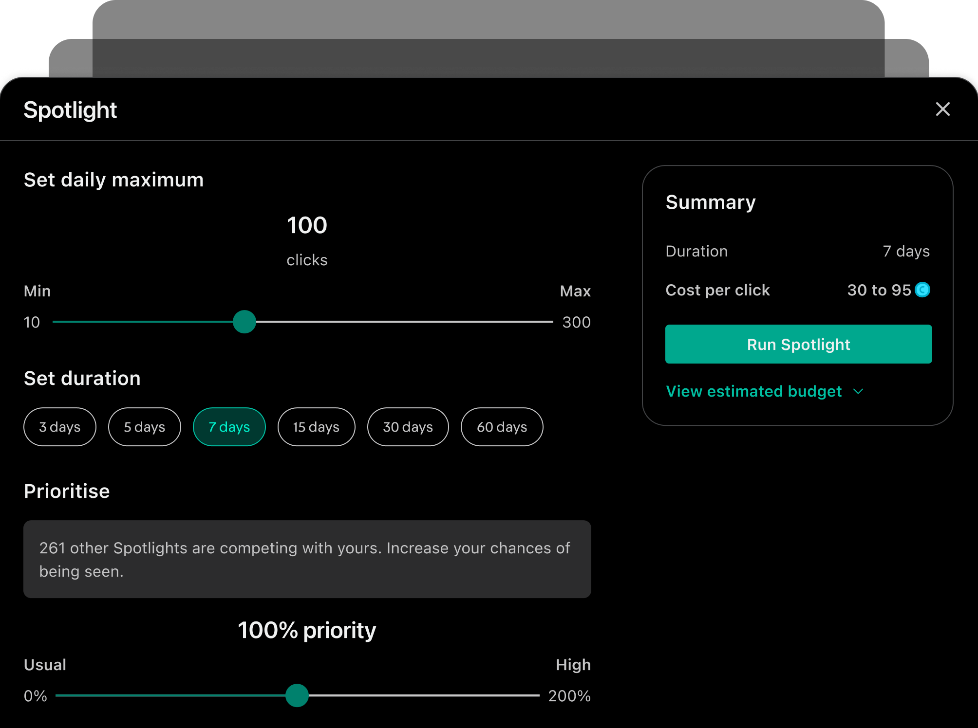
I proposed to move towards a mechanism where sellers can choose and pay for the outcome (i.e: how many sales they want).
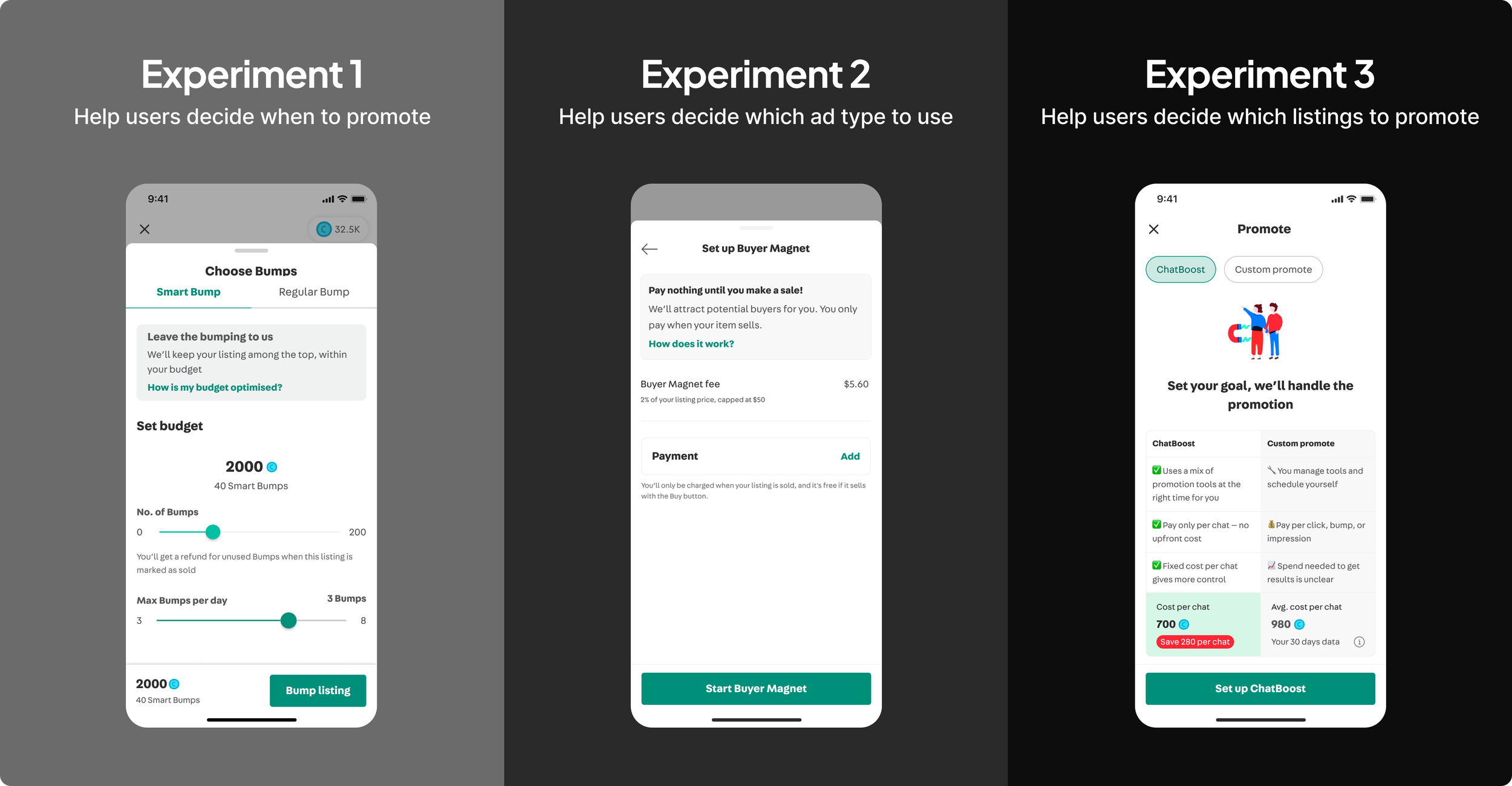
As simple as it sounds on the user-facing UX, the execution is challenging as we need to ensure stable revenue and reliable outcome delivery. I partnered with PM and lead engineer to experiment in 3 phases of abstraction:
abstracting ad timing
abstracting choice of ad type
abstracting choice of listings (ongoing)
Experimental approach
02. Make ad purchase efficient
Revamped billing flow
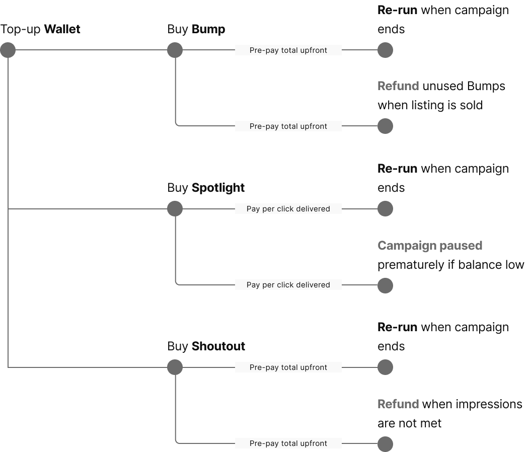
BeforeEach tool had a different billing flow, creating cognitive load for sellers.
Unhappy flows that end up in refund and paused scenarios happen often. Implementation was fragile. Many adhoc refund and rerun requests raised by CS and Sales, causing eng inefficiency.
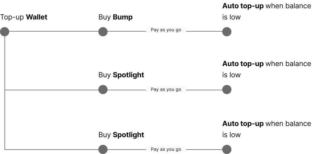
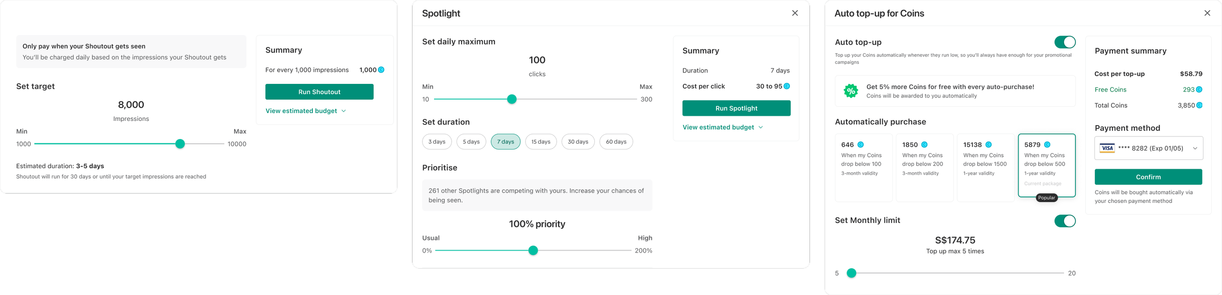
AfterMoving all tools to Pay-as-you-go billing removes refund scenarios.
Auto top-up was introduced to increase liquidity. Removes campaign paused scenarios caused by low balance.
Web-friendly design pattern for purchase flow
Carousell design is traditionally mobile-first as the main user base is casual consumers. The old ad purchase flow was a blown-up version of the mobile screen, using patterns unsuitable for web.
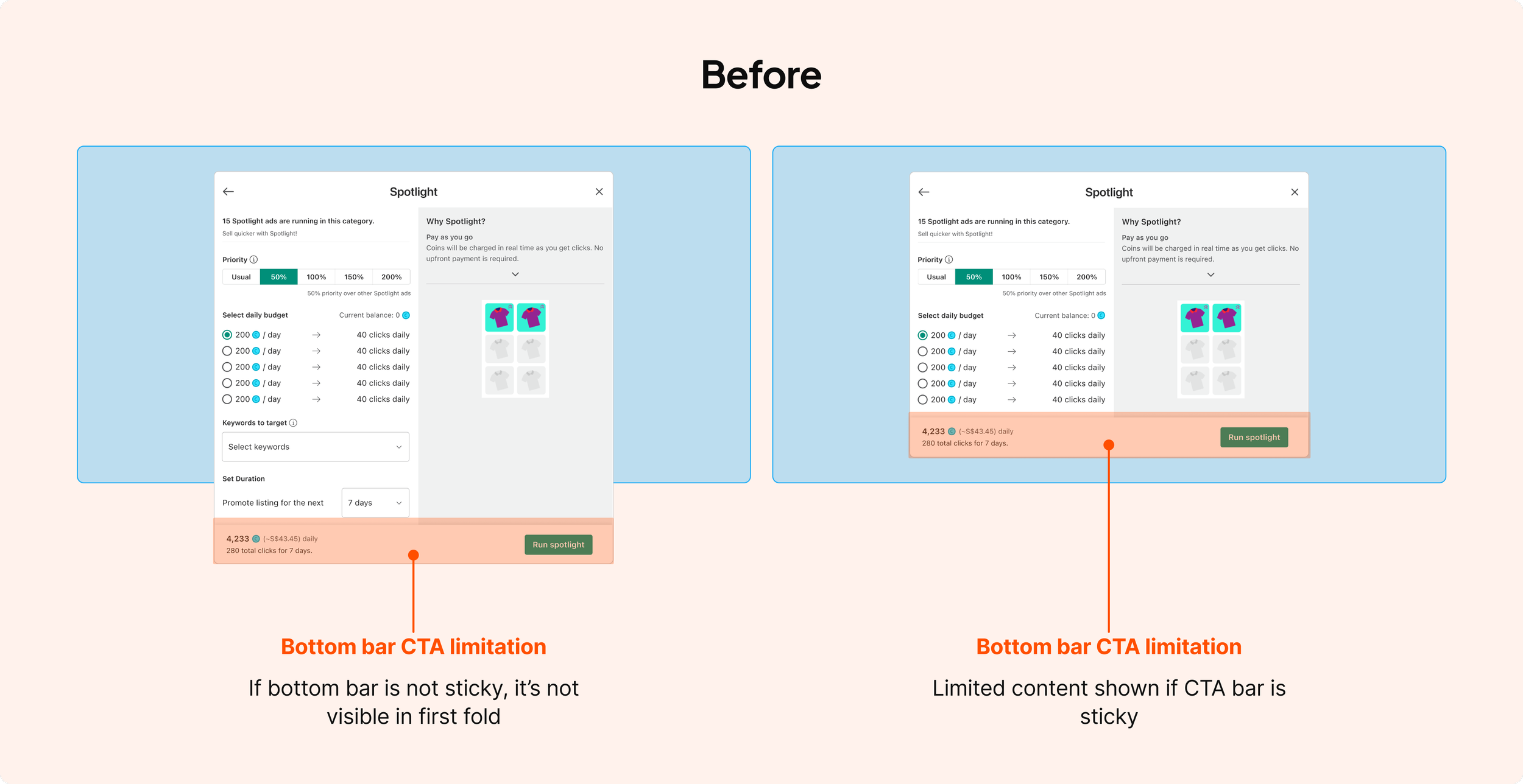
I redesigned the purchase pattern across the platform.
Re-arranged the payment summary to the side panel to support more informative breakdown and card management.
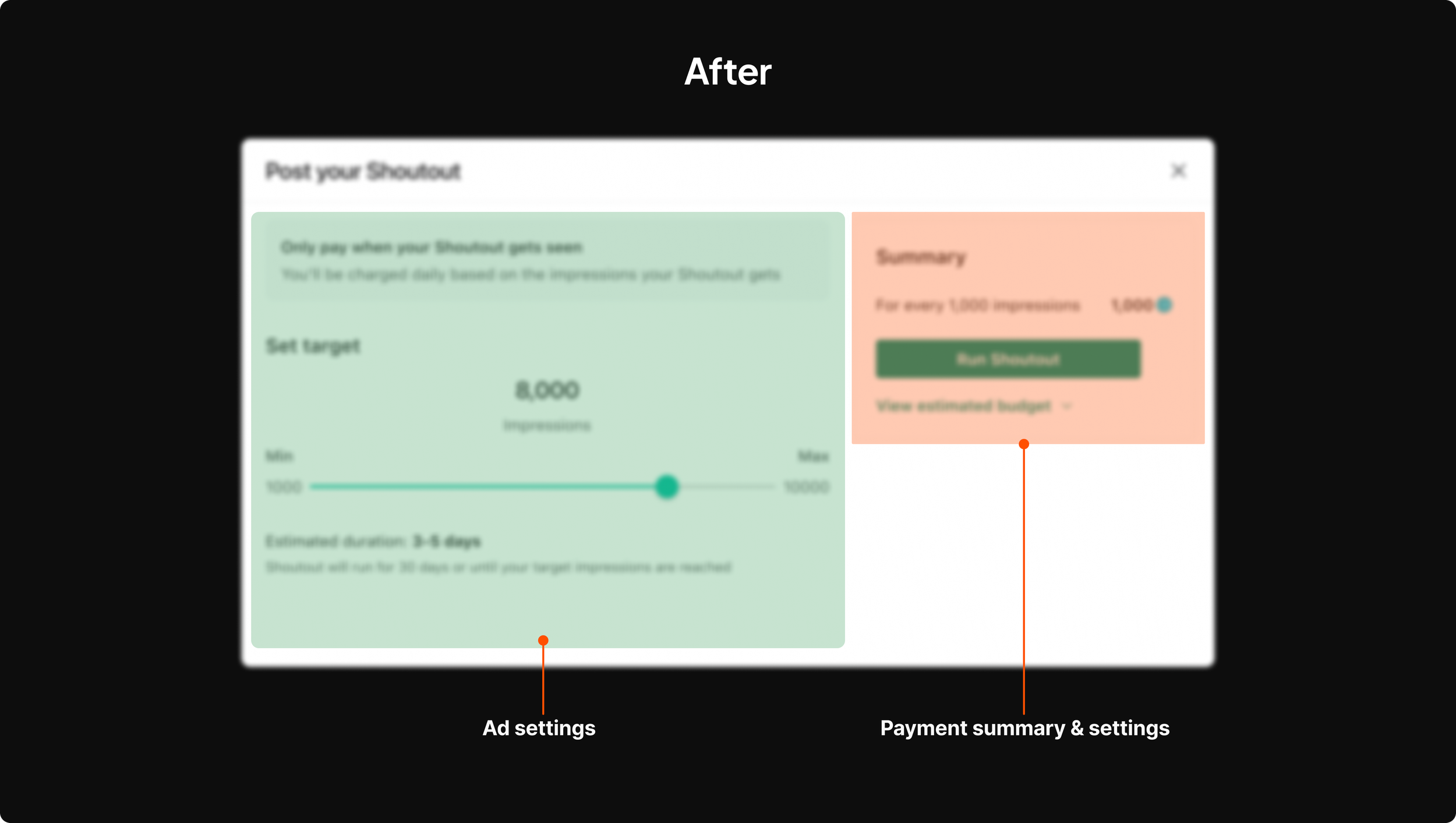
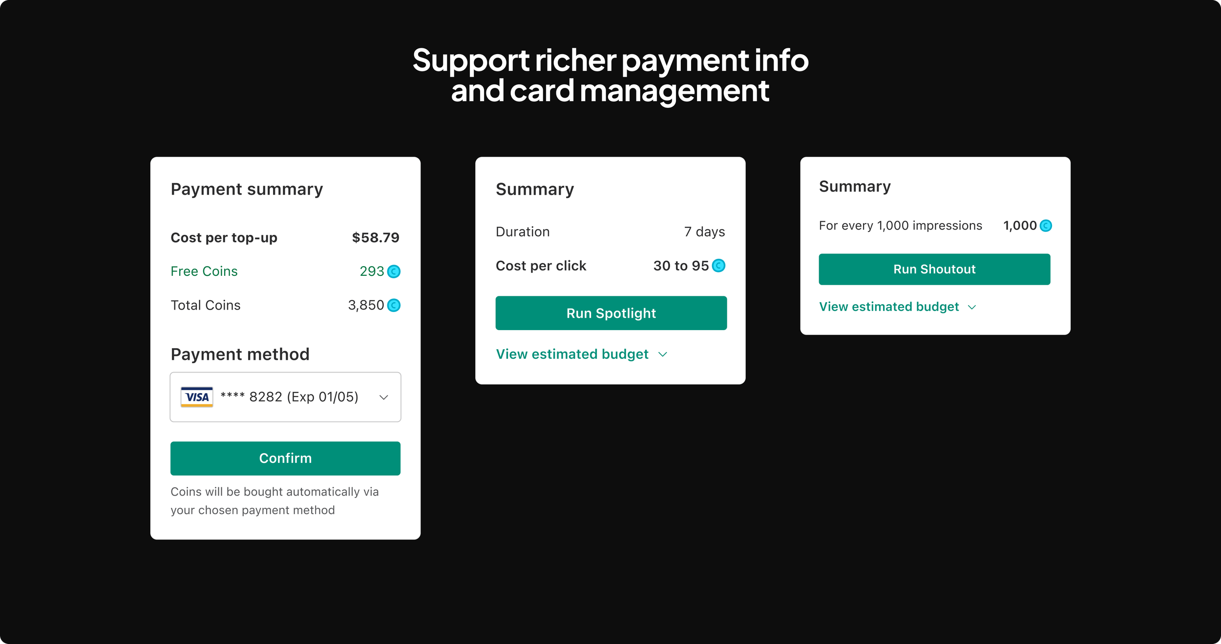
Unified input patterns across different ad products
Initiative 1: Design the backend logic for ad serving
When digging into ways to help ad performs better, I observed a stalemate in conversation between the monetization team and the growth team. I discussed with my manager, Keith, and we came up with a framework to align the user goals in both teams.
03. Make ad performs better
Monetization: “Let me show more ads!!”
Growth: “You are eroding buyer experience!!”
Stalemate
We challenged that ad has to be disruptive to the user experience.
To make ad performs better, we need to reframe “make ad performs better” to “make buyer experience for ad useful”.
Reframing
Framework
Created a buyer intent framework to align ad content with buyer intent.
Ad content <> Buyer intent framework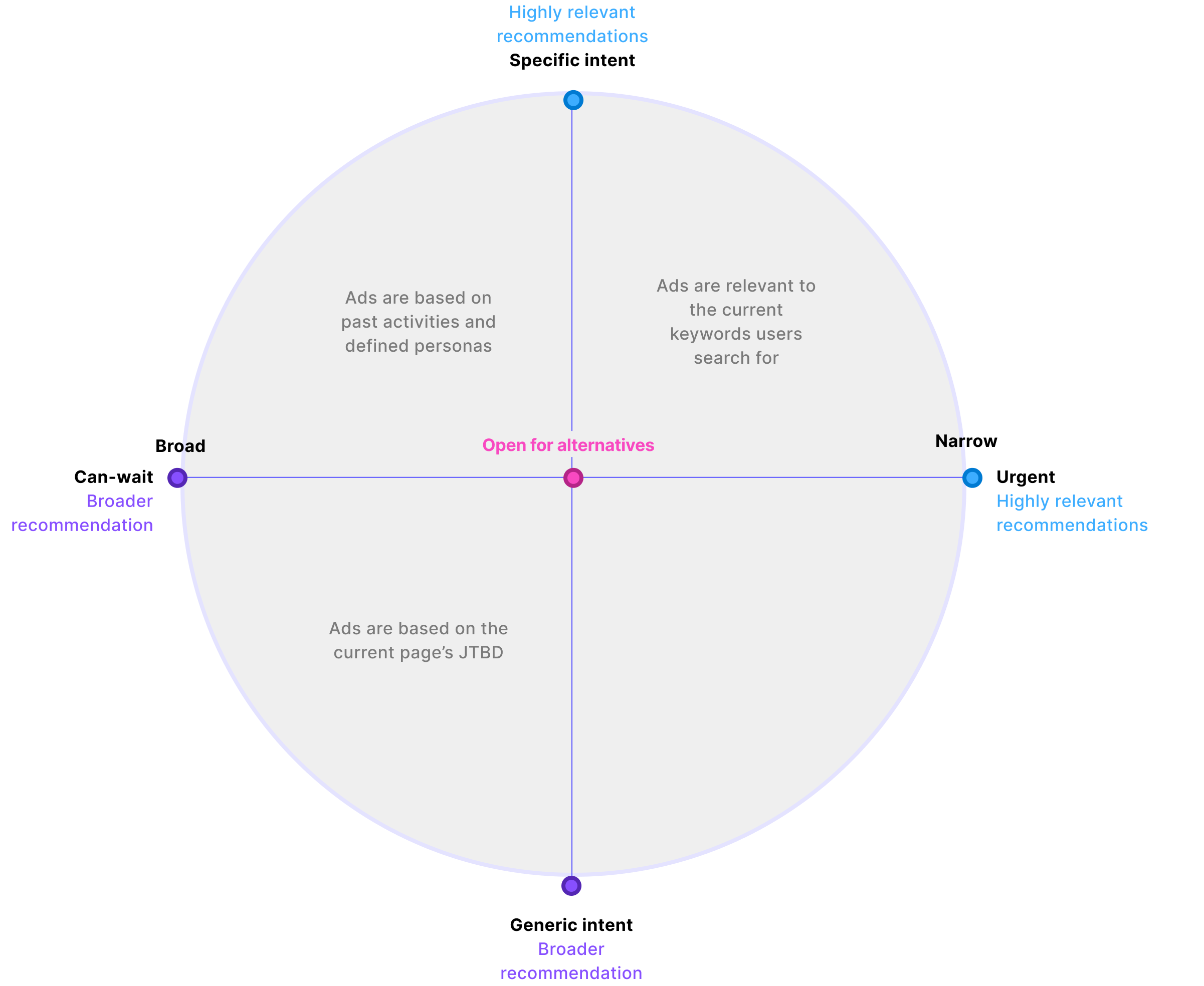
Application examples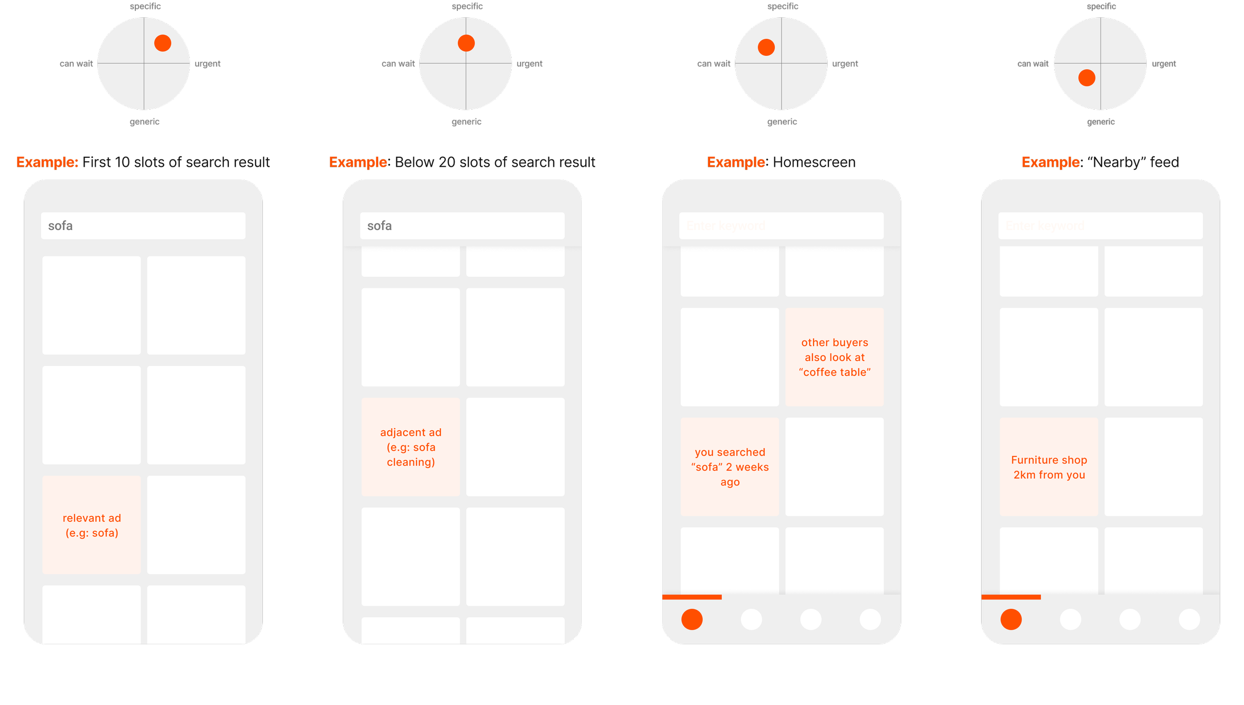
Initiative 2: Optimizing buyer-facing ad UI
I redesigned ad UI to improve product clarity and navigation. This leads to higher CTR as buyers can see the item and access actions more easily.
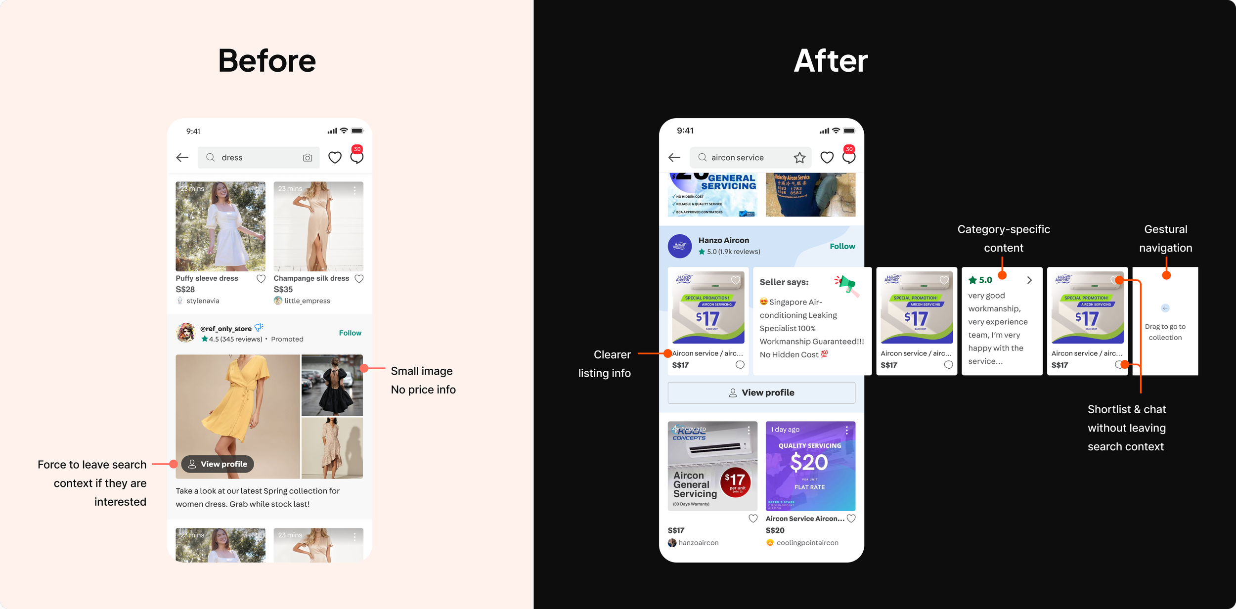
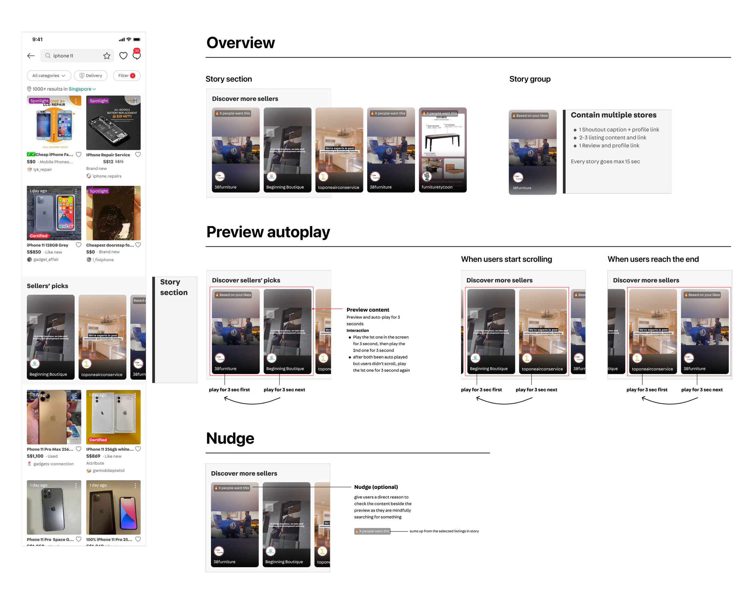
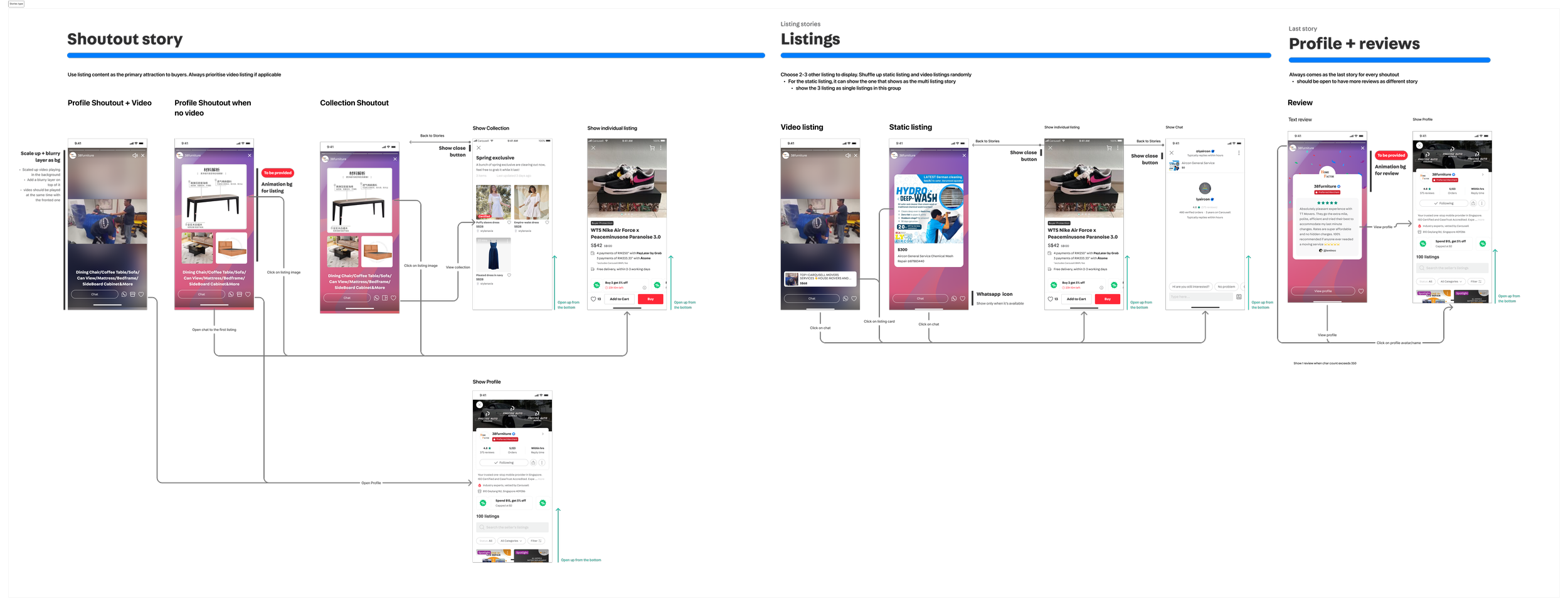
In high-value categories like Home Services and Luxury watches, trust via rich media (video and reviews) is important. I designed a new ad format, Stories, to help sellers present their offerings better.
Initiative 3: Pivoting strategy from “categories” to “clusters” with data
When reviewing results from past experiments, I dig deeper into the data to find the root cause of low ad performance.
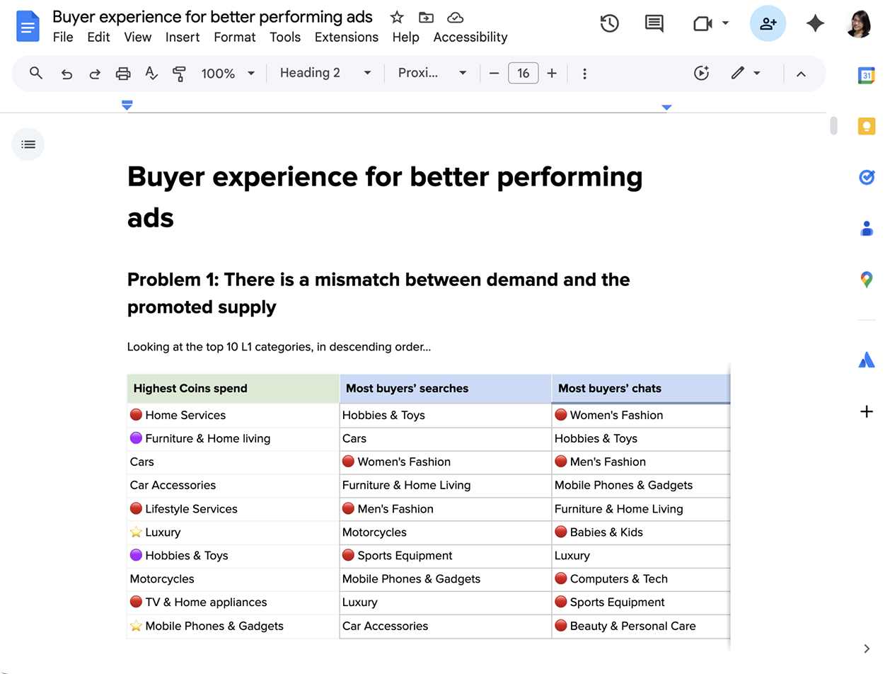
A Mismatch in supply & demandBuyers come to the platform for high-frequency, low-value categories (like fashion, toys & games). However, highest ad spenders are in low-frequency, high-value categories (like Services, Autos, Properties)
I authored a doc to higher management to highlight the problem:
If we rely on buyers’ existing intent, awareness and exposure of these categories will always remain low.
New Approach: From Categories to ClustersI worked with my manager to define a new approach: Instead of promoting each category on its own, we grouped related categories into clusters relevant to each type of buyer persona (e.g: Home cluster for Homeowners). High-frequency categories such as furniture can then help increase engagement for low-frequency categories like Home Services.
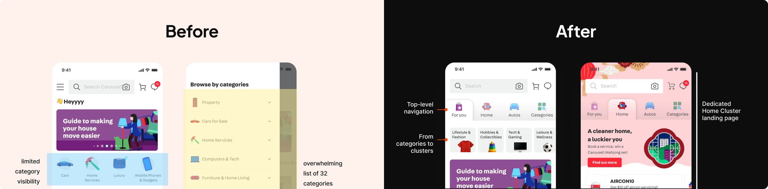
Homescreen IA change & dedicated cluster pageOld IA listed 32 categories in a flat hierarchy, overwhelming for buyers and giving limited visibility to high priority categories.
We grouped them into 6 clusters, and introduce a top-level navigation to the main homescreen to bring awareness to priority clusters.
04 Make learnings easy & meaningful
Insights → IA
I mentored a senior designer and shadowed to support her to interview pro sellers to understand their data needs and existing behaviours.
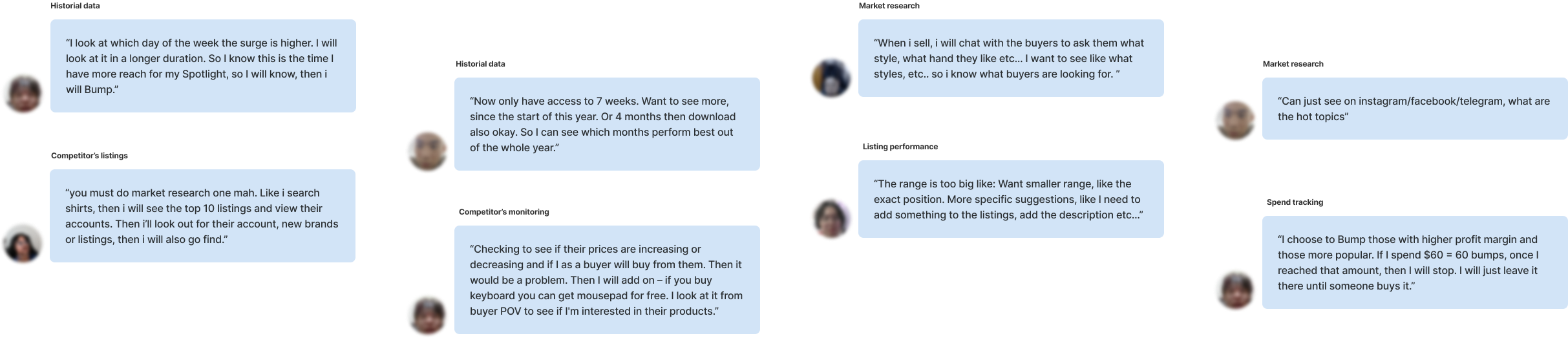
From the learnings, we synthesized sellers’ needs and opportunities along the sellers’ data journey. This informed the IA on the seller’s insight dashboard.
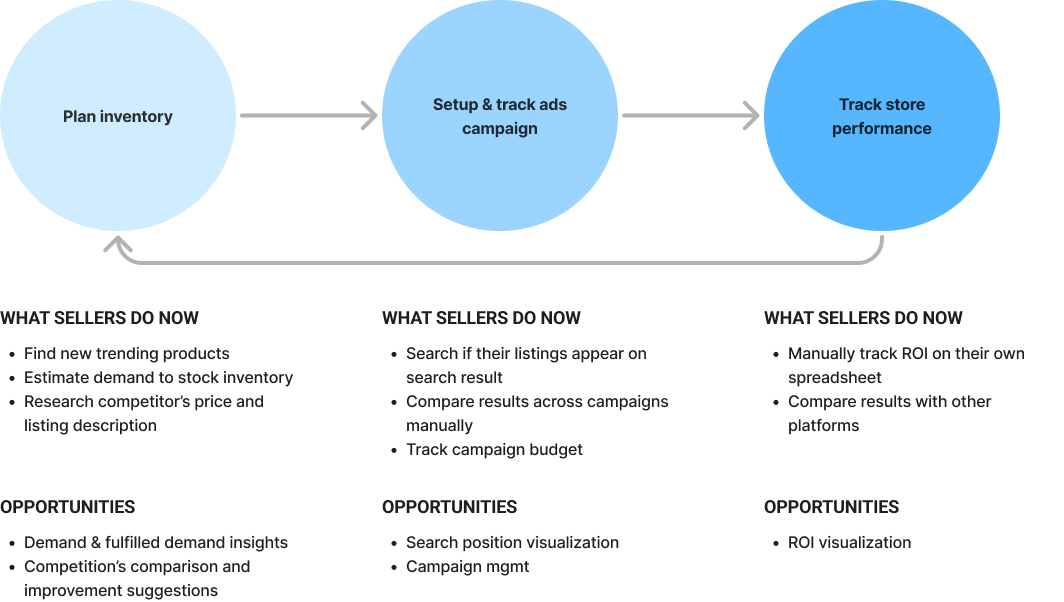
Needs and Opportunities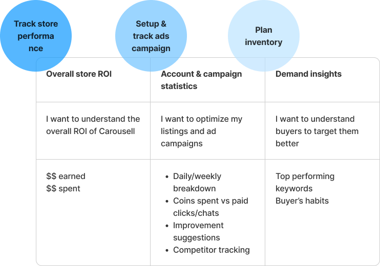
IA informed by JTBDsData visualization
There are many ways to slice and dice the same metrics to present learnings to sellers. To prevent giving sellers “many numbers” but “little insights”, I aligned with the working team on these principles for data visualization.
# 1 More intuitive, less ‘mathematical’#2 Prioritize actionable over accounting accuracy#3 Simple, # simplistic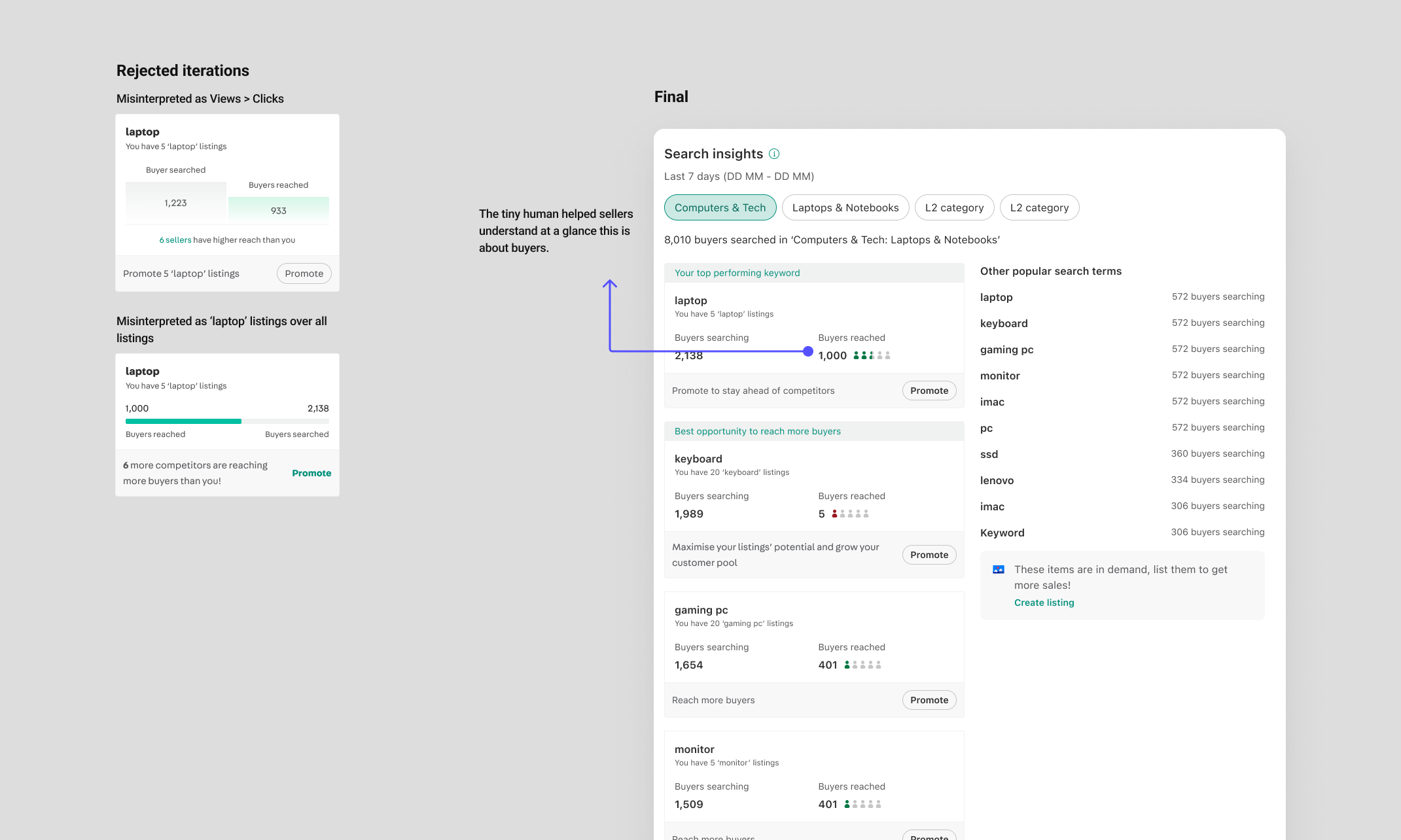
Demand insights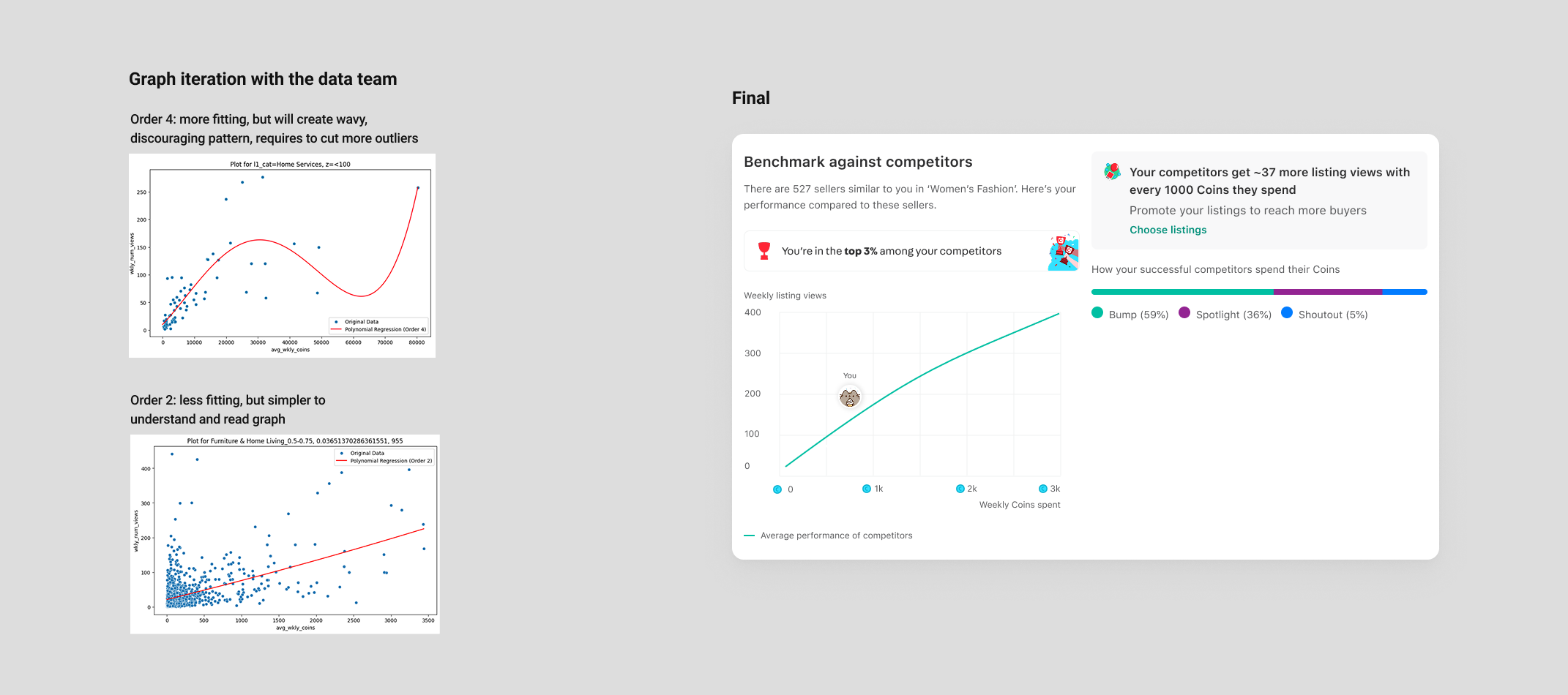
Competitor insights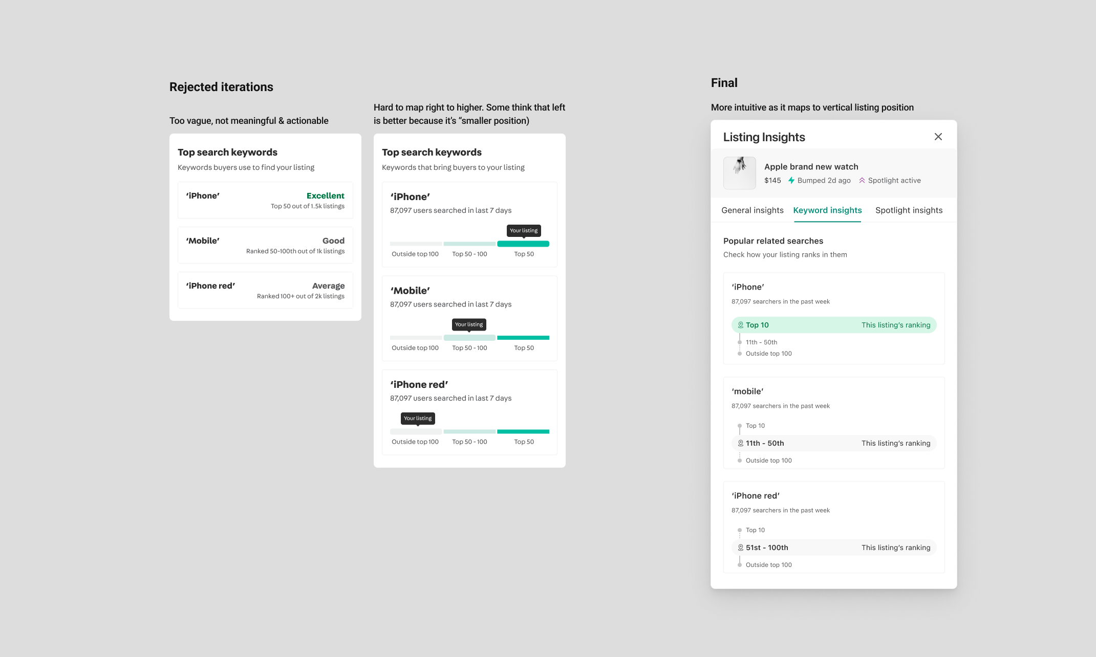
Listing ranking insights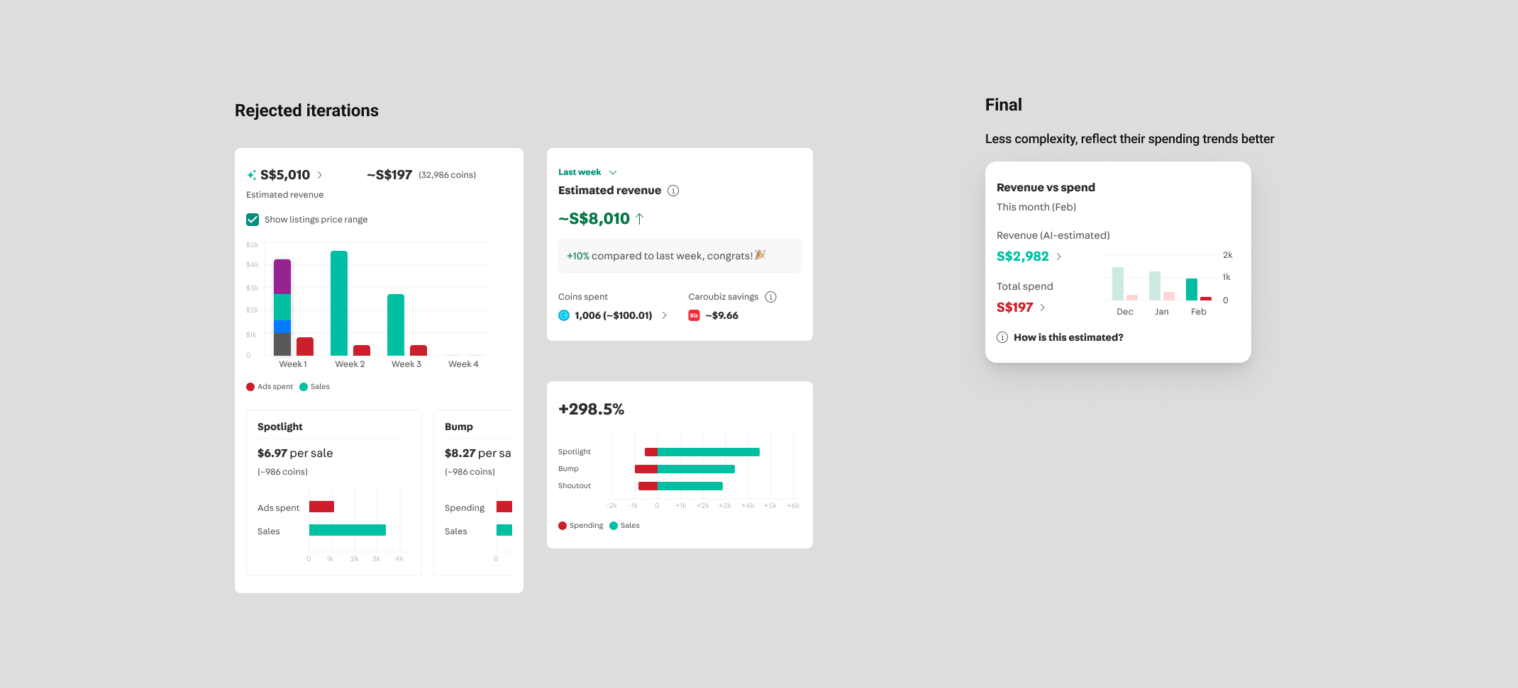
ROI insightsCampaign management
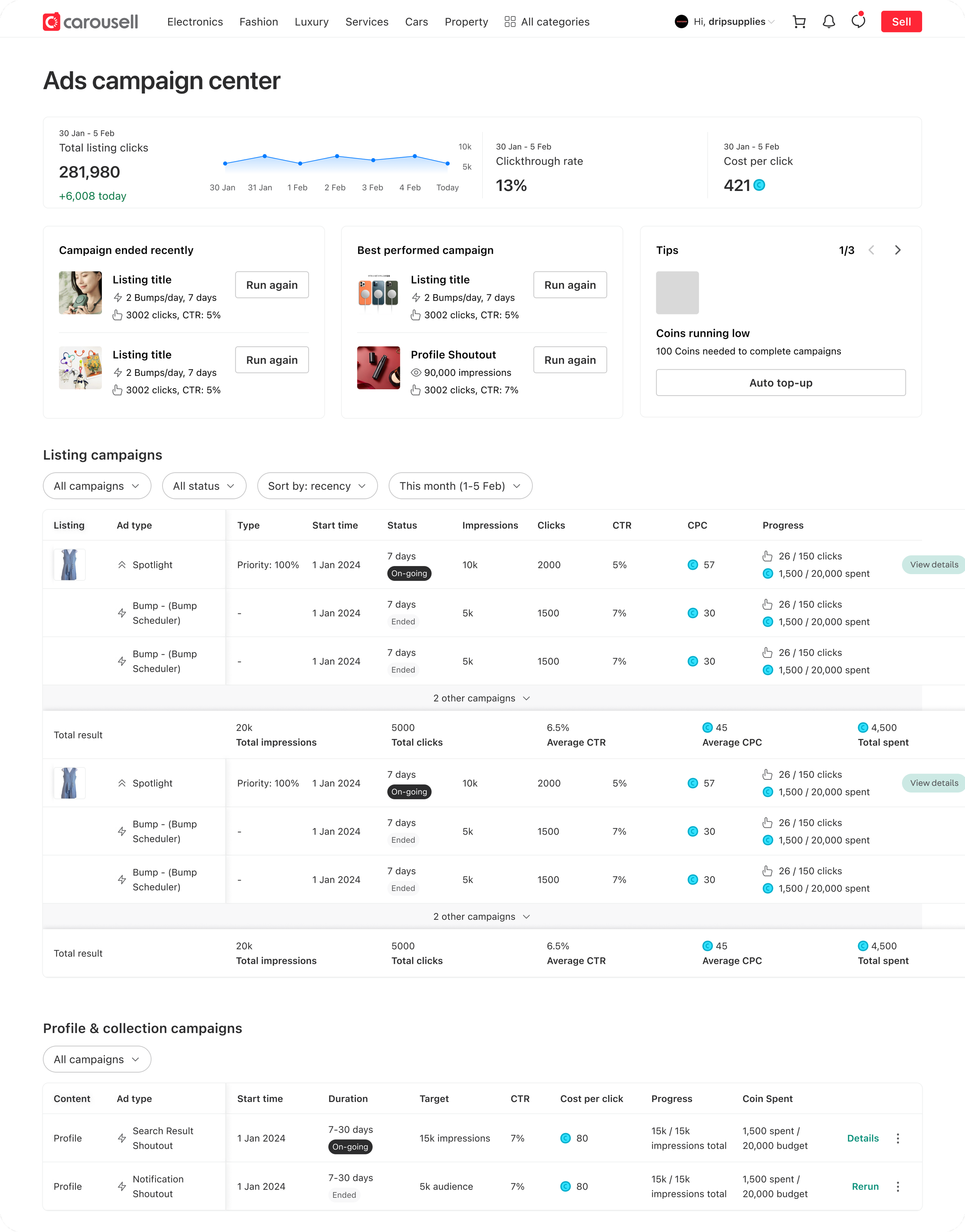
I designed a campaign management concept with a senior designer. This is waiting to be picked up by the team.
Impact
Each iteration drives both revenue and user experience impact hand-in-hand. Cumulatively, we saw:
7% ad spend uplift51% ad performance uplift for selected ad typeReduced campaign friction from locked funds and refundsStreamlined workflow & UI patternLong lasting UX & product vision
Go to next project